
Modern cycling technology has transformed how we monitor performance, health metrics, and progress. Visual dashboards now offer cyclists unprecedented insights into their rides, making data-driven training accessible to everyone.
🚴 The Evolution of Cycling Data Visualization
Gone are the days when cyclists relied solely on basic speedometers and gut feelings to gauge their performance. The digital revolution has ushered in an era where comprehensive data tracking meets intuitive visual design, creating powerful tools that transform raw numbers into actionable insights. Dynamic visual dashboards have become the cornerstone of modern cycling, bridging the gap between professional athletes and recreational riders who want to optimize their training and health outcomes.
These sophisticated platforms aggregate multiple data streams—from heart rate and cadence to power output and GPS coordinates—presenting them in visually digestible formats that make interpretation effortless. The transformation isn’t just about collecting more data; it’s about making that data meaningful and immediately applicable to your cycling goals.
Understanding the Core Components of Cycling Dashboards
A well-designed cycling dashboard operates as your command center, consolidating various performance metrics into a single, coherent interface. The most effective dashboards share several fundamental characteristics that distinguish them from basic tracking apps.
Real-Time Data Streaming and Display
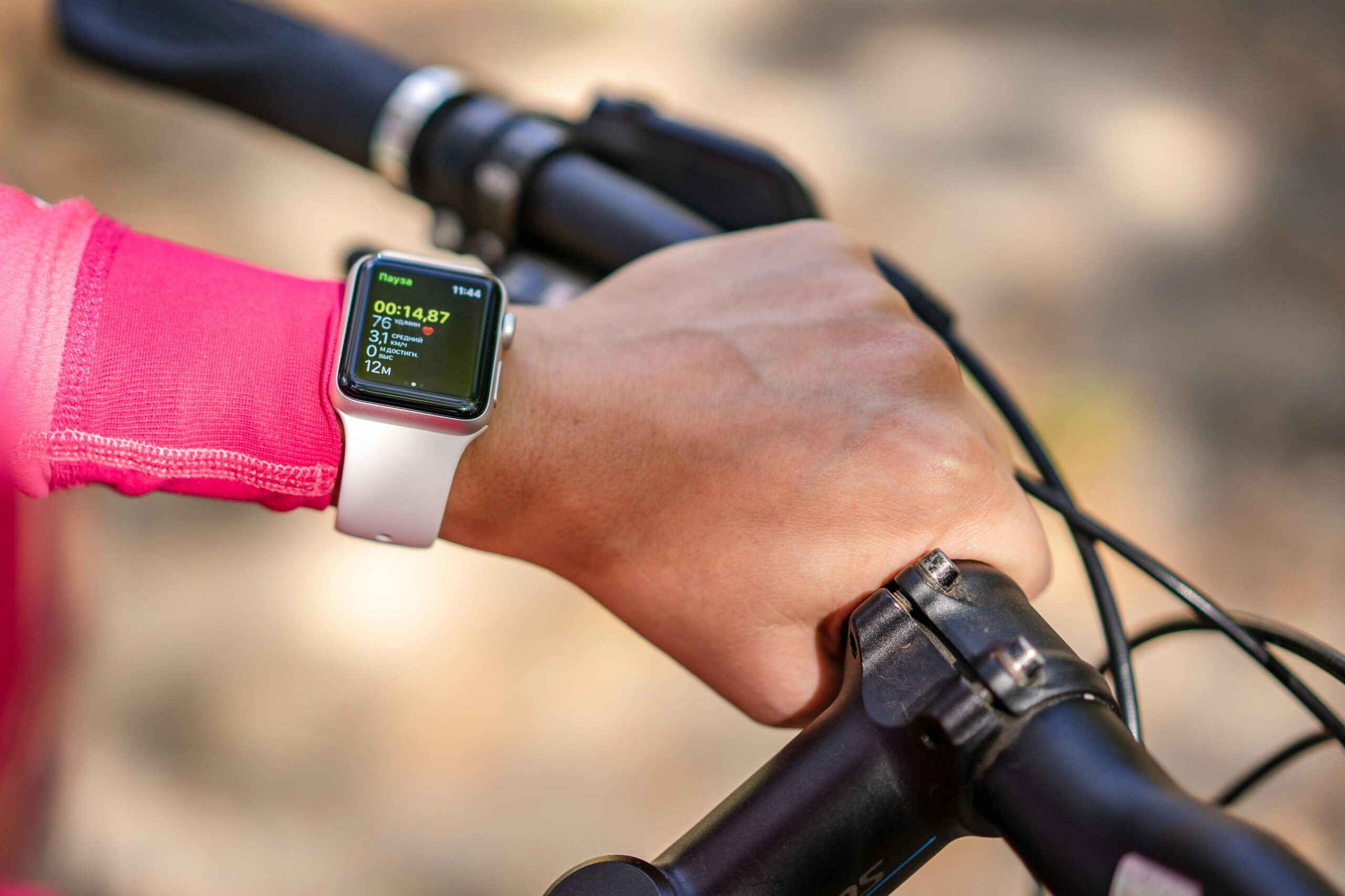
The power of modern dashboards lies in their ability to process and display information instantaneously. As you pedal, your dashboard captures heart rate fluctuations, power variations, speed changes, and elevation gains, presenting them through dynamic graphs and gauges that update in real-time. This immediate feedback loop enables you to adjust your effort on the fly, maintaining optimal training zones or pacing strategies during long rides.
Real-time visualization transforms abstract numbers into tangible visual cues. Color-coded zones indicate whether you’re pushing too hard or need to increase intensity, while trend lines show whether you’re maintaining consistent output or experiencing fatigue-related decline.
Historical Data Integration and Trend Analysis
Beyond immediate metrics, sophisticated dashboards incorporate historical data to reveal patterns and trends over weeks, months, and years. This longitudinal perspective proves invaluable for understanding your development as a cyclist, identifying seasonal variations in performance, and recognizing when training adaptations are occurring.
Visual representations of progress—whether through line graphs showing fitness improvements or heat maps displaying your most frequented routes—provide motivation and context that raw numbers alone cannot convey. These visualizations help answer crucial questions: Am I getting faster? Is my endurance improving? Are my recovery patterns optimal?
🎯 Key Metrics That Transform Your Cycling Experience
Not all data points deserve equal attention on your dashboard. Understanding which metrics matter most for your specific goals ensures you’re focusing on information that drives meaningful improvement rather than drowning in unnecessary details.
Cardiovascular Health Indicators
Heart rate monitoring remains the foundation of effective training management. Modern dashboards display not just current heart rate, but also calculate and visualize training zones, recovery heart rate, and heart rate variability (HRV). These metrics collectively paint a comprehensive picture of your cardiovascular fitness and readiness to train.
Advanced dashboards correlate heart rate data with power output or speed, revealing your efficiency at different intensities. When you notice your heart rate decreasing for the same power output over time, you’re witnessing tangible evidence of improved cardiovascular fitness—a motivating visualization that abstract numbers alone couldn’t provide.
Power Metrics and Performance Analytics
For cyclists serious about performance optimization, power-based training has become the gold standard. Dashboards that integrate power meter data unlock sophisticated analytics including Functional Threshold Power (FTP), Normalized Power, Training Stress Score (TSS), and power duration curves.
Visual representations of these metrics help you understand your strengths and weaknesses. A power curve displayed graphically instantly reveals whether you excel at short explosive efforts or sustained endurance rides, guiding your training focus accordingly. Dashboard widgets showing your power distribution across different zones ensure you’re accumulating the right type of training stress for your goals.
Cadence and Pedaling Efficiency
Cadence tracking—measuring pedal revolutions per minute—provides insights into your pedaling technique and efficiency. Dashboards displaying cadence alongside other metrics help you maintain optimal pedaling rates for different terrain and intensity levels.
Some advanced platforms visualize left-right pedaling balance and smoothness, revealing biomechanical asymmetries that might indicate injury risk or efficiency losses. These visualizations make abstract concepts like “pedaling in circles” concrete and measurable.
Health Monitoring Beyond Basic Fitness
Modern cycling dashboards have evolved beyond performance metrics to incorporate comprehensive health monitoring features that support overall wellbeing, not just faster times.
Recovery and Fatigue Management
Understanding when to push hard and when to rest is crucial for sustainable improvement. Advanced dashboards calculate recovery metrics based on training load, sleep quality, and physiological markers like HRV. Visual indicators—often using simple traffic light systems—communicate your readiness to train at a glance.
These recovery dashboards prevent the common mistake of accumulating excessive fatigue while feeling like you should always train harder. By visualizing the balance between training stress and recovery, you develop a more nuanced understanding of progressive overload and adaptation.
Nutrition and Hydration Tracking
Some comprehensive platforms integrate nutrition and hydration tracking directly into cycling dashboards. Visualizing caloric expenditure during rides alongside intake helps optimize fueling strategies for different ride durations and intensities.
Hydration reminders based on sweat rate estimates, temperature, and ride duration ensure you maintain optimal fluid balance. These features transform your dashboard from a performance tool into a holistic health management system.
📊 Customization: Building Your Perfect Dashboard
The most powerful aspect of modern cycling dashboards is their customizability. Rather than forcing everyone into a one-size-fits-all template, leading platforms allow you to construct interfaces tailored to your specific needs and preferences.
Widget Selection and Layout Design
Effective dashboard customization begins with identifying which metrics matter most for your current goals. A cyclist training for a century ride prioritizes different information than someone preparing for criterium racing or focused on weight loss.
Modern platforms offer drag-and-drop interfaces where you select and arrange widgets displaying specific metrics. You might create multiple dashboard views: one for training rides showing detailed power and heart rate zones, another for casual rides emphasizing route exploration and photography opportunities, and a third focused on recovery metrics and wellness indicators.
Data Field Prioritization
Visual hierarchy matters enormously in dashboard design. The most critical information should be immediately visible with large, clear displays, while secondary metrics can occupy smaller spaces or require minimal interaction to access.
Consider a training ride focused on threshold intervals: your primary display might show current power as a large numerical value with a color-coded background indicating your zone, while a secondary widget displays time remaining in the interval. Less critical information like total distance or average speed occupies peripheral positions where it’s available but not distracting.
🔗 Integration with Wearables and Smart Devices
The power of cycling dashboards multiplies when they seamlessly integrate with the broader ecosystem of fitness wearables and smart devices. This connectivity transforms your dashboard from an isolated data silo into a comprehensive health and performance hub.
Smartwatch and Fitness Tracker Synchronization
Modern dashboards pull data from smartwatches and fitness trackers, incorporating all-day activity levels, sleep quality, and resting heart rate into your cycling analytics. This holistic view reveals how your off-bike lifestyle impacts on-bike performance.
Seeing visualizations that correlate poor sleep nights with decreased power output or elevated heart rate for given efforts provides concrete motivation for lifestyle improvements. The dashboard becomes a feedback mechanism that extends far beyond cycling-specific training.
Smart Trainer Integration for Indoor Training
For indoor cycling sessions, dashboard integration with smart trainers creates immersive training experiences. Your dashboard can display virtual routes, control trainer resistance to simulate terrain, and provide immediate performance feedback during structured workouts.
Virtual power curves, gradient visualizations, and effort-based color coding transform monotonous indoor sessions into engaging, data-rich training experiences. The visual feedback helps maintain motivation during challenging intervals when outdoor scenery isn’t available for distraction.
Practical Applications for Different Cycling Goals
The versatility of dynamic visual dashboards means they serve diverse cycling objectives effectively, from competitive racing to casual recreational riding and health-focused exercise.
Performance Optimization for Competitive Cyclists
Competitive cyclists use dashboards to execute precise training plans, monitoring power zones during intervals, tracking chronic training load to peak for key events, and analyzing race files to identify tactical improvements. Pre-race dashboards might display pacing strategies based on course profiles, while post-race analysis dashboards reveal where time was lost or energy wasted.
Visual comparison tools allow you to overlay current rides against previous attempts on the same routes or against competitors’ data, identifying specific segments where improvements are possible. This granular analysis transforms vague notions of “riding faster” into specific, measurable action items.
Health and Fitness Improvement for Recreational Riders
Recreational cyclists benefit from dashboards that emphasize consistency, gradual progression, and health markers rather than peak performance. Visual streaks showing consecutive riding days, graphs displaying steady improvements in average speed or endurance, and calorie tracking provide motivation and structure without the intensity of competitive training.
These dashboards might prioritize exploration metrics—new routes discovered, total elevation climbed, or scenic locations visited—alongside traditional fitness markers, making cycling a rewarding adventure rather than purely a workout.
Weight Management and Overall Wellness
For cyclists using riding as a primary weight management tool, dashboards that visualize energy expenditure trends, correlate riding frequency with weight changes, and track body composition alongside performance metrics prove invaluable. Seeing concrete relationships between cycling volume and health outcomes reinforces positive behaviors and sustains long-term adherence.
🛠️ Selecting the Right Dashboard Platform
The cycling technology market offers numerous dashboard solutions, each with distinct strengths. Selecting the right platform requires evaluating several critical factors aligned with your needs and technical comfort level.
Native Features vs. Customization Potential
Some platforms offer comprehensive out-of-box functionality with sophisticated pre-built dashboards requiring minimal configuration. Others provide basic frameworks with extensive customization options, appealing to users who want complete control over their interface.
Consider your technical aptitude and how much time you want to invest in setup. If you prefer immediate utility, platforms with strong default configurations make sense. If you enjoy tinkering and have specific visualization requirements, more open platforms offer greater potential.
Data Export and Portability
Long-term data accumulation represents significant value. Platforms that facilitate easy data export in standard formats protect your historical information if you eventually switch services. Dashboard solutions that lock your data into proprietary formats create problematic dependencies.
Look for platforms supporting FIT file exports, API access for third-party integrations, and clear data ownership policies. Your years of cycling data should remain accessible regardless of platform changes.
Community and Third-Party Integration
Platforms with active user communities and robust third-party integration ecosystems offer extended functionality beyond core features. Whether integrating weather data, connecting with nutrition tracking apps, or accessing community-created dashboard templates, these ecosystems enhance long-term value.
Maximizing Dashboard Effectiveness Through Smart Usage
Possessing sophisticated dashboard tools doesn’t automatically translate to better cycling outcomes. Strategic usage patterns and disciplined interpretation separate those who benefit meaningfully from those overwhelmed by data.
Avoiding Analysis Paralysis
The abundance of available metrics can paradoxically hinder rather than help if you spend more time analyzing data than actually riding. Effective dashboard usage involves identifying a small set of key performance indicators aligned with current goals, monitoring those consistently, and resisting the temptation to obsess over every fluctuation.
Set specific review schedules—perhaps detailed analysis weekly with quick daily checks focused on recovery status—rather than constantly scrutinizing every ride. This disciplined approach maintains data’s utility while preventing it from dominating your cycling experience.
Balancing Quantitative Data with Qualitative Experience
Numbers tell important stories but don’t capture everything meaningful about cycling. The feeling of spring air during the year’s first warm ride, the camaraderie of group rides, or the meditative quality of solo exploration—these experiences matter profoundly despite resisting quantification.
Use dashboards as tools for informed decision-making and tracking progress, but occasionally ride without tracking anything, reconnecting with the pure joy of cycling unmediated by technology. This balance prevents data from eclipsing the fundamental reasons most people ride bikes.
🌟 The Future of Cycling Dashboard Technology
Emerging technologies promise to make cycling dashboards even more powerful and intuitive. Understanding these trends helps you anticipate future capabilities and make forward-looking platform choices.
Artificial Intelligence and Predictive Analytics
Machine learning algorithms increasingly power dashboard features, identifying patterns humans might miss and generating personalized recommendations. AI-driven dashboards might predict when you’re approaching overtraining before traditional metrics show obvious signs, suggest optimal training intensities based on your response patterns, or automatically adjust plans based on life stress indicators.
These predictive visualizations transform dashboards from reactive reporting tools into proactive coaching systems, anticipating your needs and guiding decisions before problems emerge.
Augmented Reality Integration
Emerging augmented reality cycling glasses promise to overlay dashboard information directly onto your field of vision, eliminating the need to glance at separate devices. Imagine seeing your current power zone as a subtle color tint at the edge of your vision, or having navigation cues appear as virtual arrows on the road ahead.
This seamless integration of data with the physical riding experience represents the ultimate evolution of cycling dashboards—information becomes ambient and intuitive rather than requiring conscious attention.
Privacy and Data Security Considerations
As cycling dashboards collect increasingly comprehensive personal data, privacy and security concerns deserve serious attention. Understanding how platforms handle your information ensures you maintain control over sensitive health and location data.
Location Privacy Management
GPS-enabled dashboards create detailed records of your riding locations, potentially revealing home addresses, daily routines, and predictable patterns. Reputable platforms offer privacy zones that automatically hide GPS data near specified addresses, and controls over who can view your route information.
Review privacy settings carefully, particularly if sharing data socially. Consider whether you want your riding patterns publicly visible or prefer keeping detailed location information private while still sharing general performance metrics.
Health Data Protection
Heart rate, weight, age, and performance metrics constitute sensitive health information deserving protection. Verify that dashboard platforms employ encryption for data transmission and storage, maintain clear data usage policies, and don’t sell personal information to third parties without explicit consent.
Understanding data ownership—whether you retain full rights to your information and can demand deletion—protects your interests as these platforms evolve and potentially change hands through corporate acquisitions.
💡 Transforming Data Into Action and Results
Ultimately, the value of dynamic visual dashboards lies not in the elegance of their displays or the volume of data collected, but in how effectively they drive behavior changes that improve your cycling and health outcomes. The most sophisticated analytics mean nothing without committed action based on insights gained.
Start by establishing clear, measurable goals that your dashboard can help you track. Whether improving your average speed on a regular route, building endurance to complete longer rides comfortably, or simply maintaining consistent riding frequency for health benefits, specific objectives give your dashboard focus and purpose.
Regularly review not just your performance data but also your dashboard usage itself. Are you actually consulting the metrics you’ve configured? Do certain visualizations motivate action while others gather dust? Iterate on your dashboard design, treating it as a living tool that evolves alongside your cycling journey rather than a static configuration you set once and forget.
Share insights selectively with riding partners, coaches, or online communities when doing so enhances accountability and provides valuable feedback. The social dimension of data sharing can multiply motivation, but maintain boundaries that preserve cycling as an enjoyable activity rather than transforming every ride into a performance pressure situation.
Remember that dashboards serve you—you don’t serve them. If tracking and analysis ever begins detracting from your enjoyment of cycling, step back and reassess. The goal is enhanced cycling experiences through informed decision-making, not data obsession that replaces the fundamental pleasure of riding bikes.
By thoughtfully implementing dynamic visual dashboards into your cycling routine, you gain powerful tools for understanding your body, optimizing training, protecting your health, and documenting your progression as a cyclist. These technologies democratize insights previously available only to elite athletes with dedicated support teams, putting sophisticated analytics in the hands of anyone committed to cycling improvement. Embrace these tools strategically, let data inform rather than dominate your decisions, and discover how visualization transforms numbers into narratives of personal growth and achievement on two wheels.