For a long time I thought color in photography was something you fixed afterward, sliding little bars around until the picture looked right. Then a student showed me two photos of the same quiet street, taken minutes apart. One felt warm and welcoming. The other felt lonely. Nothing had moved. Only the color of the light had changed. That was the day I understood that color isn't decoration we add at the end. It's part of how a photo speaks.
You don't need to study color theory to use it well. You mostly need to slow down and notice what you're already feeling. Let's walk through the few ideas that make the biggest difference.
Warm and Cool: The First Thing to Feel#
The simplest place to start is temperature. Some colors feel warm — reds, oranges, golden yellows. Others feel cool — blues, greens, soft violets. We carry these associations everywhere. A warm room, a cool morning, the warm glow of a lamp, the cool blue of dusk.
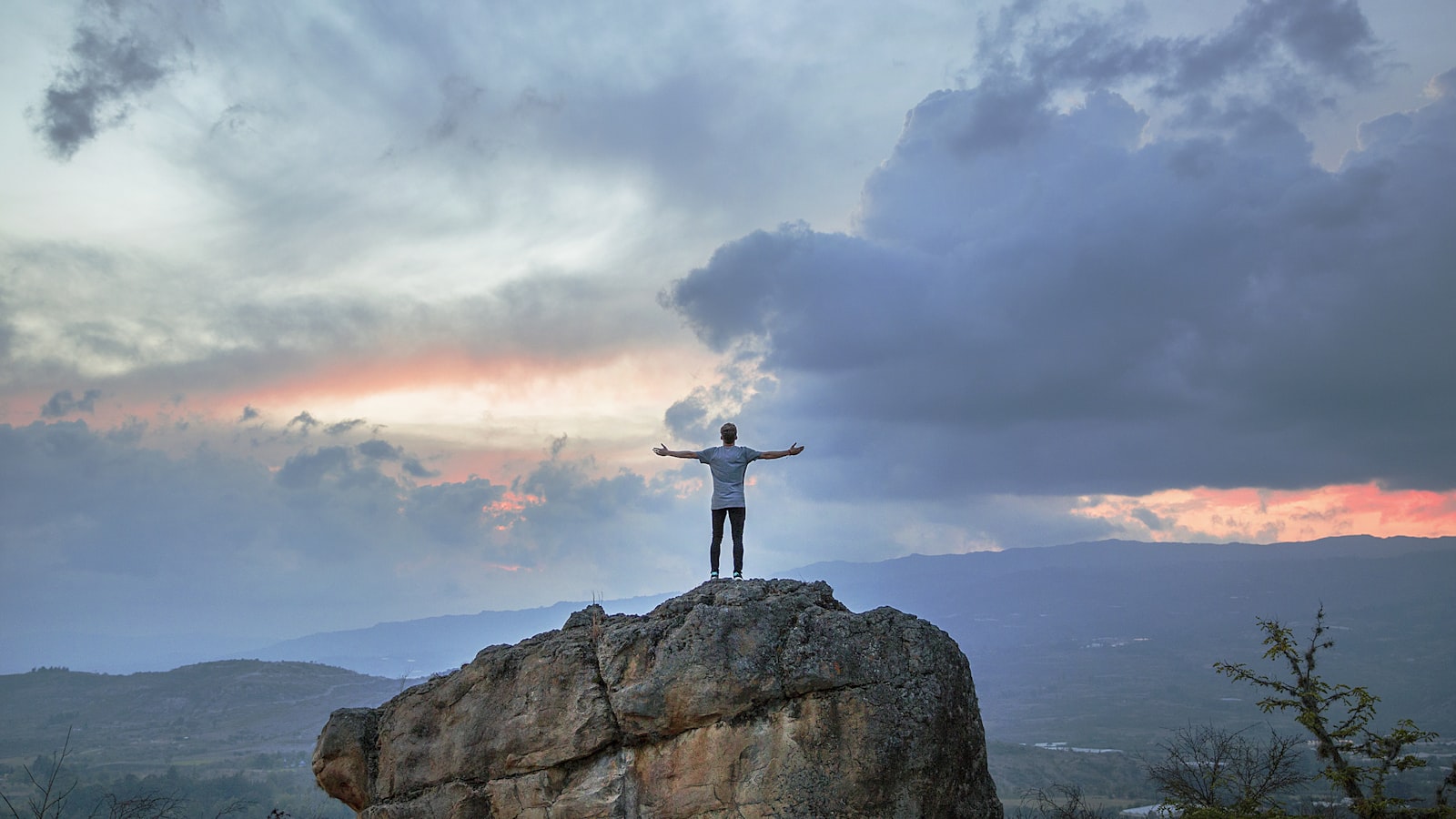
In a photograph, warm colors tend to feel close, intimate, and comforting. Think of late afternoon sun on a kitchen table. Cool colors tend to feel calm, quiet, and a little distant — the blue hour after sunset, the green shade under trees. Neither is better. They're just different moods, and you get to choose which one fits your scene.
The easiest way to start using this is to simply ask, before you shoot: do I want this to feel warm or cool? Then look at the light. Open shade is cool. Golden-hour sun is warm. Indoor lamps are usually warm; daylight through a north window is cool. You can often pick your mood just by choosing where you stand.
Harmony: Colors That Belong Together#
When a few colors in a photo come from the same neighborhood, the picture feels settled. This is harmony. A scene of sand, driftwood, and dry grass is all warm earth tones, and it reads as a single calm note rather than a clatter of competing voices.
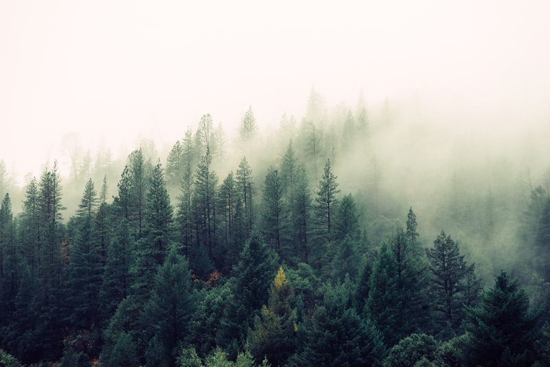
You can find harmony almost anywhere once you start looking. A foggy morning hands it to you for free — everything softens toward the same pale gray-blue. A forest gives you a hundred greens that all agree. Even a messy room can become harmonious if you frame the part where the colors quietly rhyme.
A photo doesn't need many colors to be rich. Often the most memorable images live almost entirely in one family of tones, with everything pulling in the same direction.
When you want harmony, look for it before you press the shutter rather than hoping to build it later. Step left or right until the loud, clashing thing slips out of frame. Wait for the cool shadow to fall across the warm wall, or don't. You're not changing the world; you're choosing the angle on it.
Contrast: Spending Color on the Subject#
Harmony is restful, but sometimes you want the eye to snap to one spot. That's where color contrast comes in. A single color that sits opposite the rest — one red boat in a blue harbor, one yellow umbrella on a gray street — becomes a magnet. The eye goes straight to it and stays.
This is one of the most reliable tools you have, and it's worth using on purpose. The rule of thumb is simple: spend your strongest color contrast on the thing you most want noticed. If the brightest, most opposite color in your frame is a stranger's jacket in the background, that's where attention goes, even if your real subject is somewhere else. So either move so the contrast lands on your subject, or wait for the distraction to pass.
A little contrast goes a long way. You don't need the whole frame to clash. One small patch of a complementary color against a quiet field is often more powerful than a scene full of bright hues, because the eye has somewhere clear to land.
Complementary pairs worth remembering#
You don't have to memorize a color wheel, but a few pairings come up again and again in everyday scenes:
- Blue and orange — sky against skin, water against autumn leaves.
- Red and green — a flower against foliage, a coat against a hedge.
- Yellow and purple — a lit window at dusk, wildflowers in shade.
Spot these pairs in the world and you'll start seeing photos waiting to be taken.
Restraint: The Courage to Leave Color Out#
Here's the idea that took me longest to learn. More color is not more beautiful. Some of the most moving photographs are nearly colorless on purpose — a misty harbor in grays, a snowfield with one dark tree, a portrait against a plain wall. When you strip color away, what's left has room to be felt.
Restraint can mean choosing scenes that are already quiet, like an overcast day or a monochrome corner of a room. It can mean stepping back from a busy, colorful place and finding the one calm patch inside it. And yes, it can mean deciding later that a picture wants to be black and white, because its strength was never in its hues but in its light and shape.
Leaving color out is not giving up. It's a decision, the same as adding it. A photo that whispers in two or three tones can hold a viewer longer than one that shouts in ten.
Learning to See It#
The good news is that you already feel color. You know a warm room from a cold one, a cheerful color from a somber one. Photography just asks you to notice that feeling consciously and then point your camera with it in mind.
Try this for a week. Each time you raise your phone or camera, pause for one second and name the mood of the color in front of you. Warm or cool? Harmonious or clashing? One bright accent, or a quiet field of related tones? You don't have to act on every answer. You're just training your eye to register what was always there.
Color will never be a formula. It's a sense, and senses get sharper with use. The photographers whose work feels rich aren't reaching for more color than you have. They're choosing, again and again, which colors to keep and which to let go. Anyone can learn to make that choice. You can start with the very next picture you take.